
 Layla Zulfa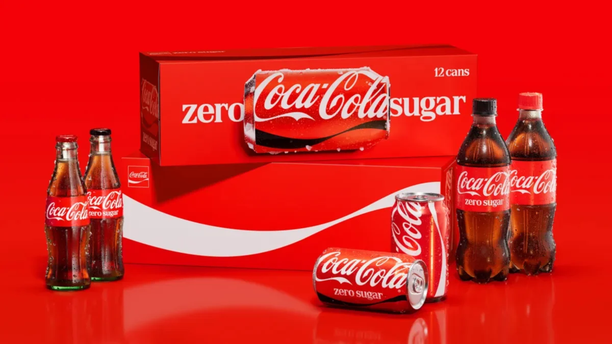
In a move that underscores the power of brand consistency, The Coca-Cola Company has officially unveiled a sweeping visual identity overhaul. On July 20, the beverage giant announced a strategic redesign of its global packaging, retail displays, vending infrastructure, and digital presence. While the iconic red hue and Spencerian script remain the bedrock of the brand, the company is implementing a more cohesive visual language designed to bridge the gap across its 200-plus international markets.
This initiative is not merely an aesthetic update; it represents a fundamental shift in how the world’s most recognizable beverage brand communicates its identity. By streamlining its visual assets—including the celebrated Dynamic Ribbon and the Arden Square—Coca-Cola is aiming to create a singular, unmistakable experience for consumers whether they are purchasing a drink from a vending machine in Tokyo, a grocery store in London, or a digital storefront in Buenos Aires.
The Core Philosophy: "Make Coca-Cola More Coca-Cola"
The directive behind this massive undertaking was surprisingly concise. Rapha Abreu, Global Vice President of Design at The Coca-Cola Company, summarized the objective in a recent statement to Creative Bloq: “Make Coca-Cola more Coca-Cola, everywhere.”
This philosophy drives the current strategy of "design simplification." In an increasingly fragmented media landscape, Coca-Cola is doubling down on its most recognizable assets. The goal is to strip away visual noise and focus on the elements that define the brand’s DNA: the classic red and white palette, the flowing script logo, and the signature curves of its packaging. The company’s leadership suggests that by unifying these elements, they are strengthening the brand’s "visual equity," ensuring that even in a crowded retail environment, a Coca-Cola product remains instantly identifiable from a distance.
A Chronology of Evolution: From "Real Magic" to Global Unity
To understand the weight of this current refresh, one must view it within the timeline of the brand’s recent evolution. Coca-Cola has long been a master of reinvention, maintaining a balance between nostalgic tradition and modern innovation.
- 2016 – The "One Brand" Strategy: Coca-Cola pivoted to a "One Brand" marketing approach, moving away from fragmented sub-brand advertising to highlight the parent brand. This laid the foundation for the current visual overhaul.
- 2021 – The "Real Magic" Platform: Following a global pandemic that changed consumer behavior, Coca-Cola introduced its "Real Magic" campaign. This era brought about the "Hug" logo—a curved, adaptive version of the script that physically cradled the product. It was a move toward emotional connection, emphasizing the communal experience of sharing a Coke.
- 2026 – The Unified Visual System: The current July 2026 update marks the next logical step in this journey. While the "Real Magic" platform provided the emotional messaging, this new visual system provides the logistical and aesthetic architecture to support that message globally.
The Design Architects: Who Refined the Icon?
The execution of such a massive global shift requires specialized expertise. According to industry reports from Transform magazine, the project was a collaborative effort involving some of the design world’s most influential players.
The primary global identity was developed by the branding agency JKR (Jones Knowles Ritchie), a firm known for its work in simplifying iconic brands for the digital age. Complementing this, the packaging system—the actual physical architecture of the cans and bottles—was reworked by the design studio The Superultrarare. Their focus was on functional ergonomics and visual hierarchy, ensuring that the brand’s identity could scale across different formats, from small cans to large-format plastic bottles and fountain dispensers.
Deep Dive: The Bold Redesign of Coke Zero Sugar
The most significant visual departure in this refresh is reserved for the Coca-Cola Zero Sugar lineup. As the company continues to see a consumer shift toward lower-sugar alternatives, the branding for the "Zero" category has been elevated to carry the same visual weight as the original soda.
The new Zero Sugar cans feature significantly enlarged typography. The words "Zero Sugar" are now the focal point, designed to dominate the visual space. Furthermore, the brand has introduced a bold, black version of the Dynamic Ribbon, creating a sharp, high-contrast look that stands out against the red background.
A key functional update involves the bottle caps. Moving forward, plastic bottles for Zero Sugar variants will feature black caps, providing an immediate, non-verbal cue for consumers to differentiate the product from the original red-capped classic formula. This is a classic example of "design for utility," where the packaging itself acts as a navigation tool for the consumer in the split-second decision-making process at the point of sale.
Supporting Data: Why Consistency Matters
Marketing research consistently shows that brand consistency can increase revenue by up to 20%. For a global juggernaut like Coca-Cola, even a marginal increase in brand recognition across its 200 markets represents a monumental gain in market share.
The data suggests that the "visual clutter" of modern retail environments makes it harder for brands to cut through. By standardizing the placement of the logo, the scale of the typography, and the saturation of the "Coke Red," the company is essentially lowering the cognitive load for the shopper. When the brain spends less time identifying a product, the likelihood of a purchase increases. This is the science of shelf-presence, and it is a primary driver behind why Coca-Cola is investing millions into this global harmonization.
Official Responses and Corporate Strategy
Arnab Roy, Global Category President at Coca-Cola, provided insight into the company’s internal rationale during the announcement. "This refresh is about being clearer and more consistent in how we show up, wherever people experience our brand," Roy stated.
The emphasis is on the word "wherever." In the digital age, a brand’s presence is not limited to a grocery store shelf; it exists in social media feeds, on mobile apps, and within gaming environments. A digital-first design ensures that the logo remains legible on a smartphone screen, while the same design principles hold up when printed on a massive billboard.
The company has been careful to emphasize that this is not a rebrand. They are not changing the logo, the name, or the formula. They are, in their own words, "sharpening the identity." By avoiding a total overhaul, they mitigate the risk of alienating the long-term consumer base that associates the current look with comfort and history.
Global Rollout and Future Implications
The transition is currently underway, with the new designs appearing in Latin America, Europe, the Middle East, and Asia. These regions were selected for the initial rollout due to their diverse retail landscapes, which will serve as a testing ground for the new visual system’s flexibility.
Notably, North American consumers will have to wait for the rollout, as the company has not yet set a definitive timeline for the U.S. and Canadian markets. Analysts suggest this staggered approach is a tactical choice, allowing the company to refine its supply chain and marketing materials based on real-world feedback from the initial markets.
The Broader Impact on the Beverage Industry
The implication of this move is likely to ripple through the consumer-packaged-goods (CPG) industry. As competitors observe Coca-Cola’s success in streamlining its identity, many may feel pressured to simplify their own portfolios. We are currently witnessing an era where "less is more." Complex, multi-layered logos are being replaced by minimalist, flat, and high-contrast designs.
Coca-Cola’s latest move confirms that in a world where attention spans are measured in milliseconds, the brands that win are the ones that prioritize clarity. By doubling down on the iconic elements that made the brand a global household name in the 20th century, Coca-Cola is positioning itself to remain relevant and dominant well into the future, proving that even a 130-year-old brand can find new ways to stay fresh.

 Siti Muinah
 Nana Wu
 Neng Nana

 Lina Hope
 Sagoh
Sagoh
 Iffa Jayyana